Clearity, conccepts and other fun with AI logo generation
Ah, the thrill of starting a new blog/newsletter in 2024!
Choose a memorable name and URL. Prep that first post. And — natch — use ChatGPT to create a logo!
I'm struggling to pick from so many good options...
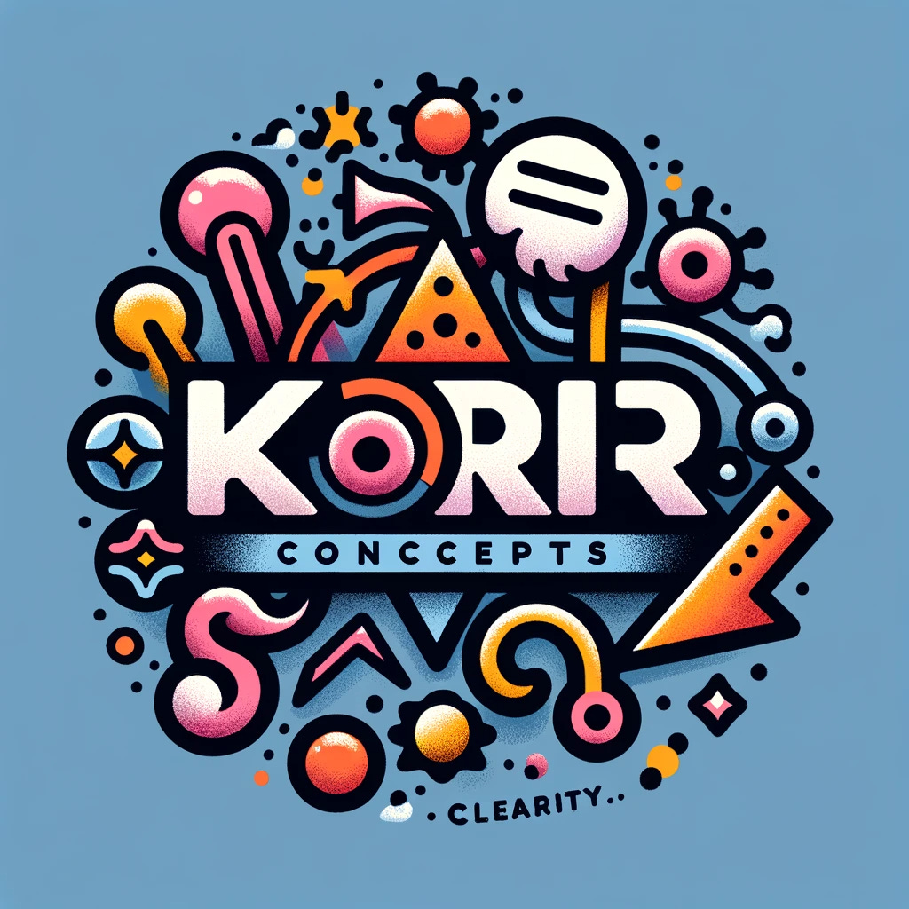
Clearity: An instant classic
Here's the prompt I started with:
Make me a logo for my new blog and newsletter, Korr Concepts. I write about fuzzy and funky concept models, and how I make sense of them and turn them into clarity.
Voila:
I have a soft spot for this one. It's peak AIrt uncanny valley: the airbrushed textures; the vaguely disconcerting nonsense-blob elements; the misspellings. "Clearity" makes me laugh every time!
If I were planning to write primarily about AI, I'd probably choose this logo.
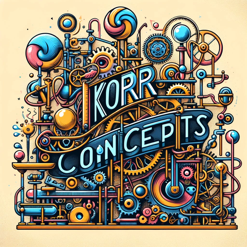
Rube Goldbergs: Not bad!
Next I asked:
Can you try a version that's a little more rube goldbergish?
The first try:
Pretty good! I especially like the lollipop whirls and the blue pig nose. But that typo reads as a flaw — not funny enough to use.
I asked for a revision:
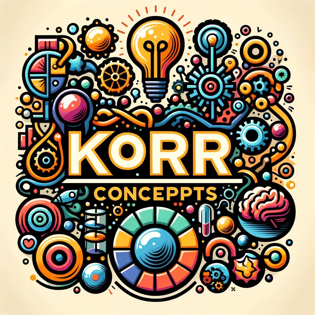
Nailed it! Only problem is it may imply a physical-product focus. So I asked:
Could you try a version that incorporates thinking motifs or elements?
Meh — worst of both worlds.
Style Explorations
Next I shifted gears to play with different art styles.
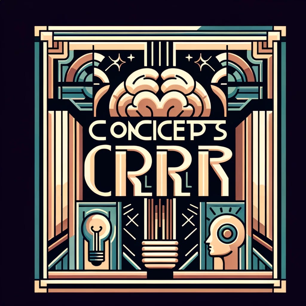
Art Deco
These are both great (Sglpessieng!), but not quite the vibe I'm going for.
Film Noir Poster
Pretty weak: I appreciate the individual noir(ish) motifs, but this is not movie-poster style. (Also what is the man next to the cat holding?!?)
Rock Concert Posters
Next I asked for the style of 1960s rock concert posters:
Hmmm. Not only is this no Milton Glaser — at this point a DALL-E Default house style is emerging: again the airbrush and nonsense blobs; the circles and swirls; the particular color palette and saturation. "Exlainzy and fuzzy finky" can't salvage this one.
DALL-E Default also foiled a stab at 1980s-rock-concert-poster style:
A second attempt is still far from rock concert posters, but at least captures an '80s aesthetic (and apparently the '80s vogue for pom-pommed hand grip strengtheners?):
Polish Cyrk Posters
My wife is fascinated by Polish cyrk (circus) posters (we have two), so I also asked for that style.
Huh. That would have made more sense from the 1960s-concert-poster prompt.
As an AIrt connoisseur, I appreciate this one for the incongruous mix of DALL-E Default style and undercurrent of unease. But not what I'm going for. (Plus it has nothing to do with Polish cyrk posters.)
Polish Resistance Posters
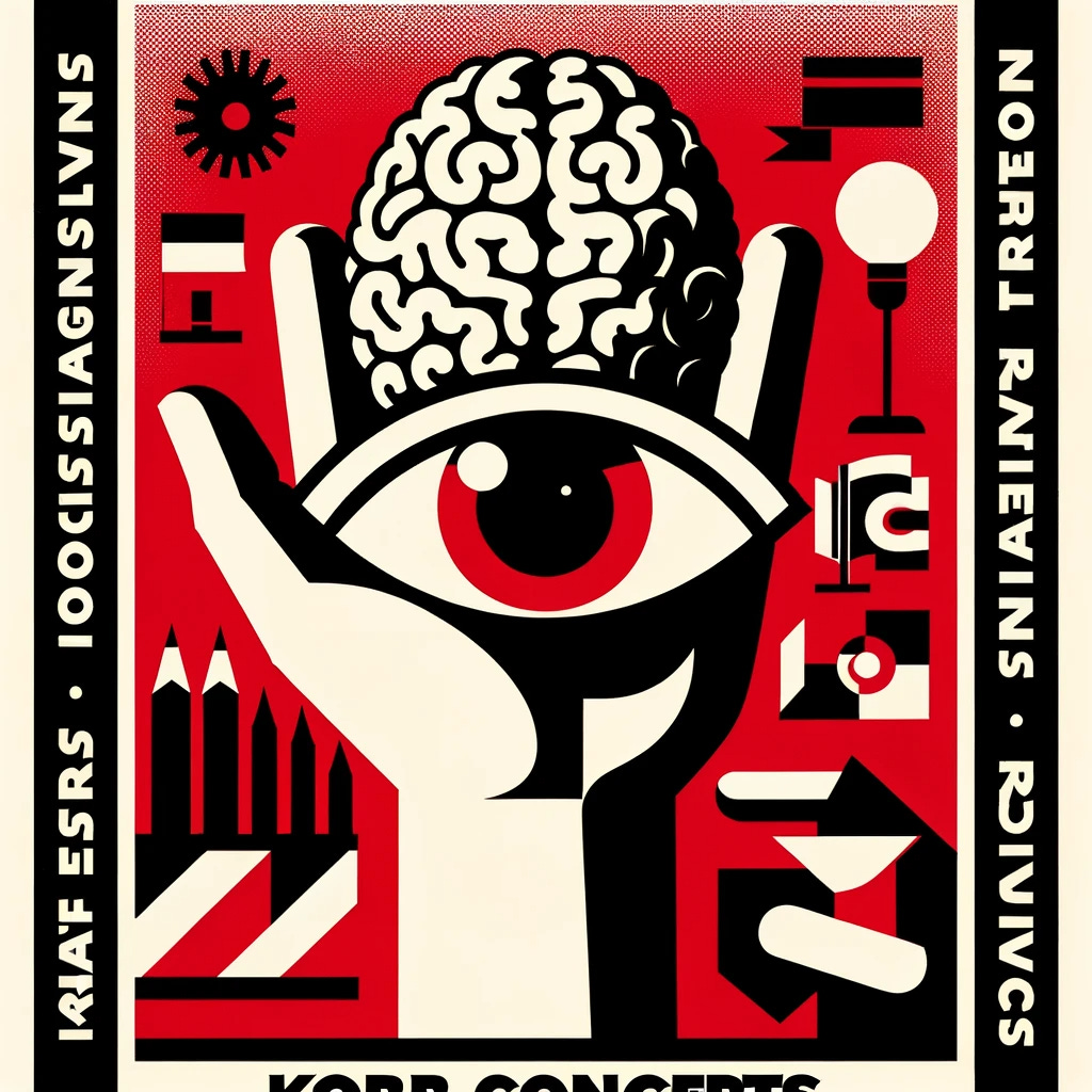
Initially I couldn't remember the term "cyrk," so I asked for the style of "1960s Polish resistance posters" instead.
Wow — that's pretty stunning. Here the nonsense words actually feel like part of the poster: more menacingly runic than unintentionally funny. But overall, it's too authoritarian and alarming.
The (tentative) winner
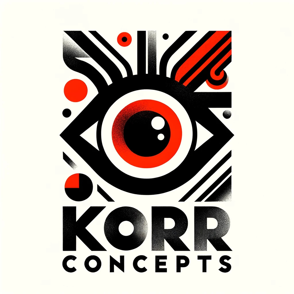
Now we're talking! The giant eye is right on the edge of authoritarian, but the screenprint effects and a few curves and circles give it enough warmth and humanity. This is also by far the least AIrt-y and ironic of the bunch.
I picked this one for now, but I'd love to hear your favorite(s)!


